

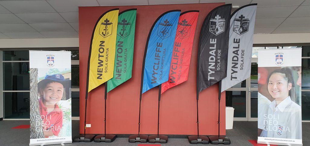
We are excited to announce an updated look to our three Houses.
Rehoboth has a long tradition of using a House system as part of our pastoral care program. Some might still remember the old Rubies, Diamonds and Sapphires system (based on the College colours). This was replaced in 2009 with the current system of Newton, Tyndale and Wycliffe.
The 2009 change was done with the aim of connecting students with the rich heritage of the Christian faith. Each House is named after a notable Christian figure and draws on three of the Five Solas for the House mottos – Sola Gratia, Sola Fide and Sola Scriptura.
We are thankful to Mr Rob Stirling (former Secondary School Principal) who was instrumental in giving each of the newly-named Houses their unique visual identities, which have served us well for almost a decade.

Newton House
Motto: “Sola Gratia” (By Grace Alone) Colours: Green and Gold
This House is named after John Newton (1725-1807), hymn writer and pastor. Originally a ship’s captain, Newton was involved in the slave trade. His conversion to Christianity followed his miraculous survival during a gale at sea. Newton later became a pastor and wrote many hymns, including “Amazing Grace”. He also played a prominent role in the anti-slavery movement.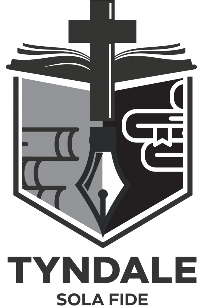
Tyndale House
Motto: Sola Fide (By Faith Alone) Colours: Black and White
This House is named after William Tyndale (1494-1536), a teacher, translator and preacher. He believed in justification by faith alone. After moving to Germany, he completed his translation of the New Testament into English and had it published. This was significant in that it gave people access to the Bible in a language they could understand.
Wycliffe House
Motto: Sola Scriptura (By Scripture Alone) Colours: Blue and Red
This House is named after John Wycliffe (c1330-1384). He was called the “Morning Star of the Reformation” as he challenged a number of the accepted practices of the Church. He based his views on the absolute authority of the Bible, God’s law, which he distinguished from the teachings of the Church. He argued that everyone had the right to examine the Bible for themselves.The Senior Leadership Team felt that now was the time to update this visual identity. All the core elements are still in place – House names, colours, mottos and emblems. In modernising the design, however, our goal has been to give each of these elements “room to breathe,” while achieving a logo that can be used from sports to academic activities and everything in between.
Central to each House – and to the College as a whole – are the emblems of the cross and open Bible, so we have incorporated these into each design. Then the House emblem – Newton’s anchor, Tyndale’s pen, and Wycliffe’s compass – is the identifying feature and a worthwhile talking point – for example, why is the emblem of Tyndale House a pen? Because of William Tyndale’s instrumental work in translating the Bible into English.
We hope you find the new look as striking in its simplicity as we do. The new logos were launched at assemblies at each School during the last weeks of Term 2. At each launch, House captains and staff were invited reflect on who their Houses are named for and the significance of their emblem and motto. It was a wonderful opportunity to reflect on the astonishing lives of people God has used so mightily to preserve His Word and spread the Gospel.